Dominion Energy (SCANA Corporation)

Easy account management sent satisfaction soaring.

UX Problem

Ancient, limited account-management functionality frustrated users.

How We Helped

We made aggravating tasks as pain-free as possible with the right features.

SCE&G (Scana) landing page. Customer name and account information is prominently displayed at the top of the screen on a blue background. Below, the current balance, recent bills and averages, messages, and quick links.

User Research involved hands-on experience with users, stakeholders, and data.

Methods

User-Led Personas, Direct Observation, Paper Prototype Testing, Card Sorting

User persona for Judy Sims, Budget-Conscious Customer. At the top of the page, a stock photo, quote, and four columns of demographics. Below, four columns outlining needs, thoughts, pain points, tasks, and recommendations for users like Judy.

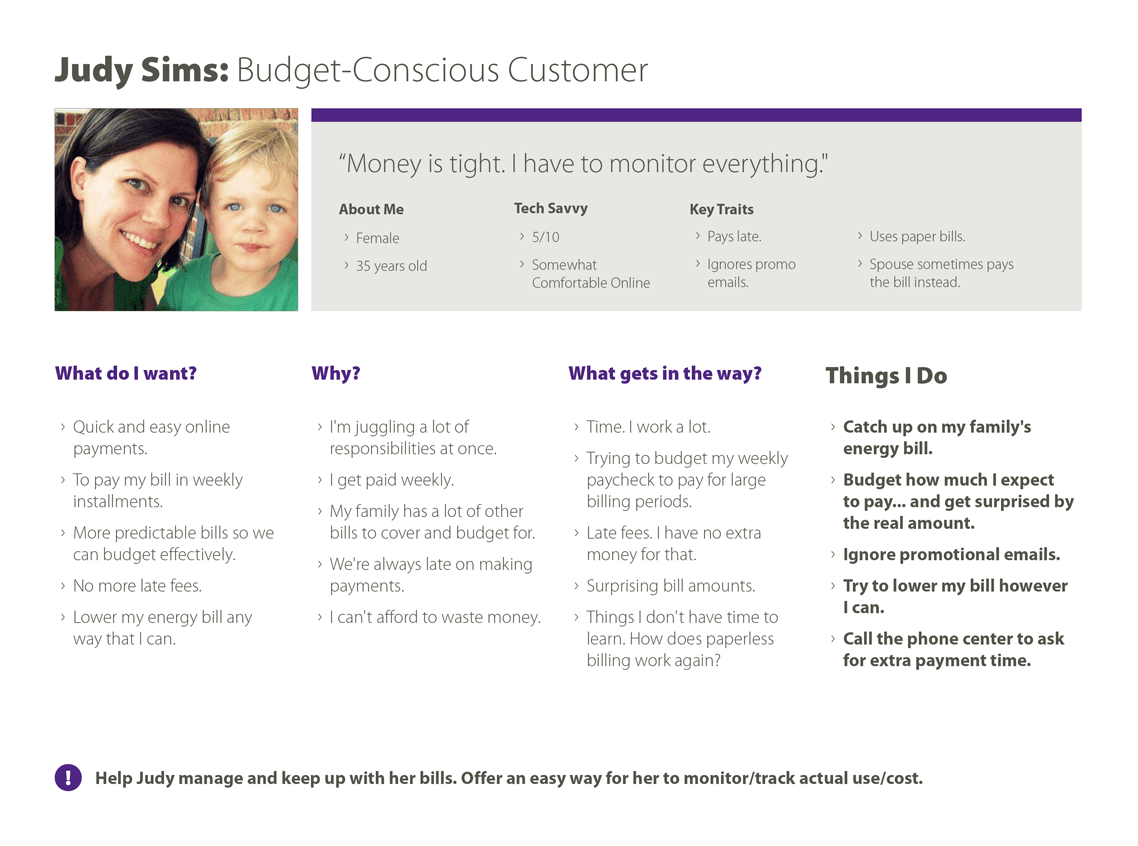
Understanding the user base. The wide array of users demanded similar yet varying account management needs.

Card Sort user exercise report. On the left, card sorting is defined, while on the right, high-level results are given about the common categories users self-organized along with challenging page/sections to categorize.

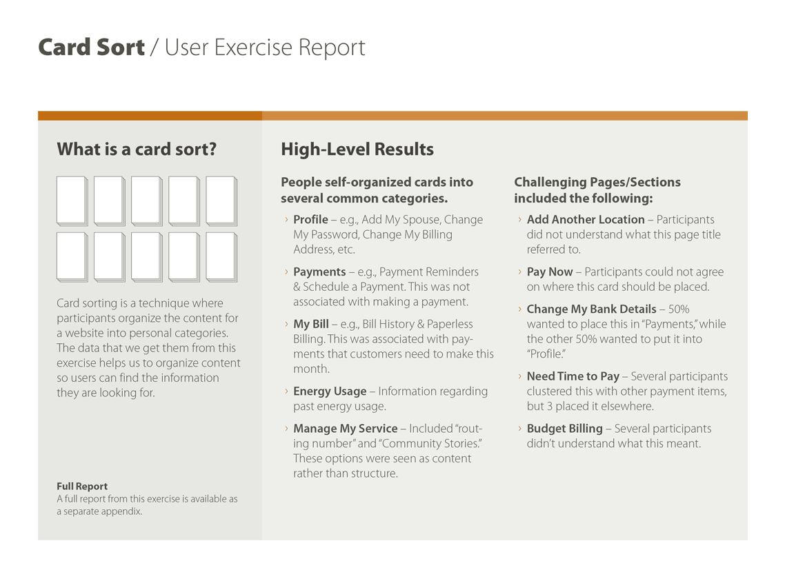
User perceptions. Card sorting helped break down the way users think about how information should be grouped together.

The rigor and passion truematter puts into user experience design is truly unique.

Customer Insights and User Experience Manager, Dominion Energy (SCANA Corporation)

Business Goals unite with specific user needs.

Methods

Digital Product Review, Stakeholder Discussion, Customer Interviews and Observation, Analytics

A page from a user experience roadmap showing a table of goals under the heading Create a flexible system that can grow and evolve.

Stakeholder-User Balance

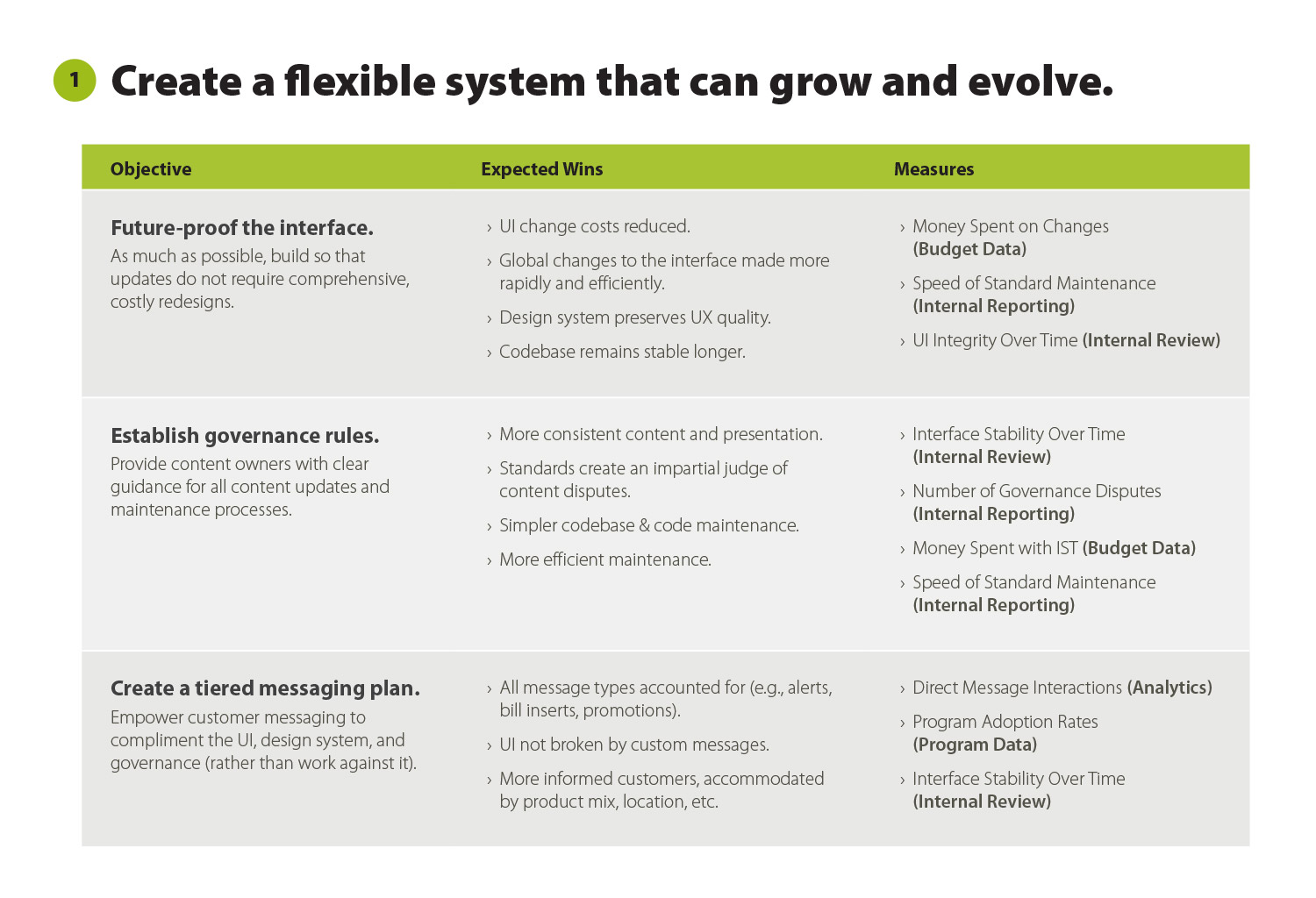
Laying out a path that leads to success for the business and its customers.

The Way Forward

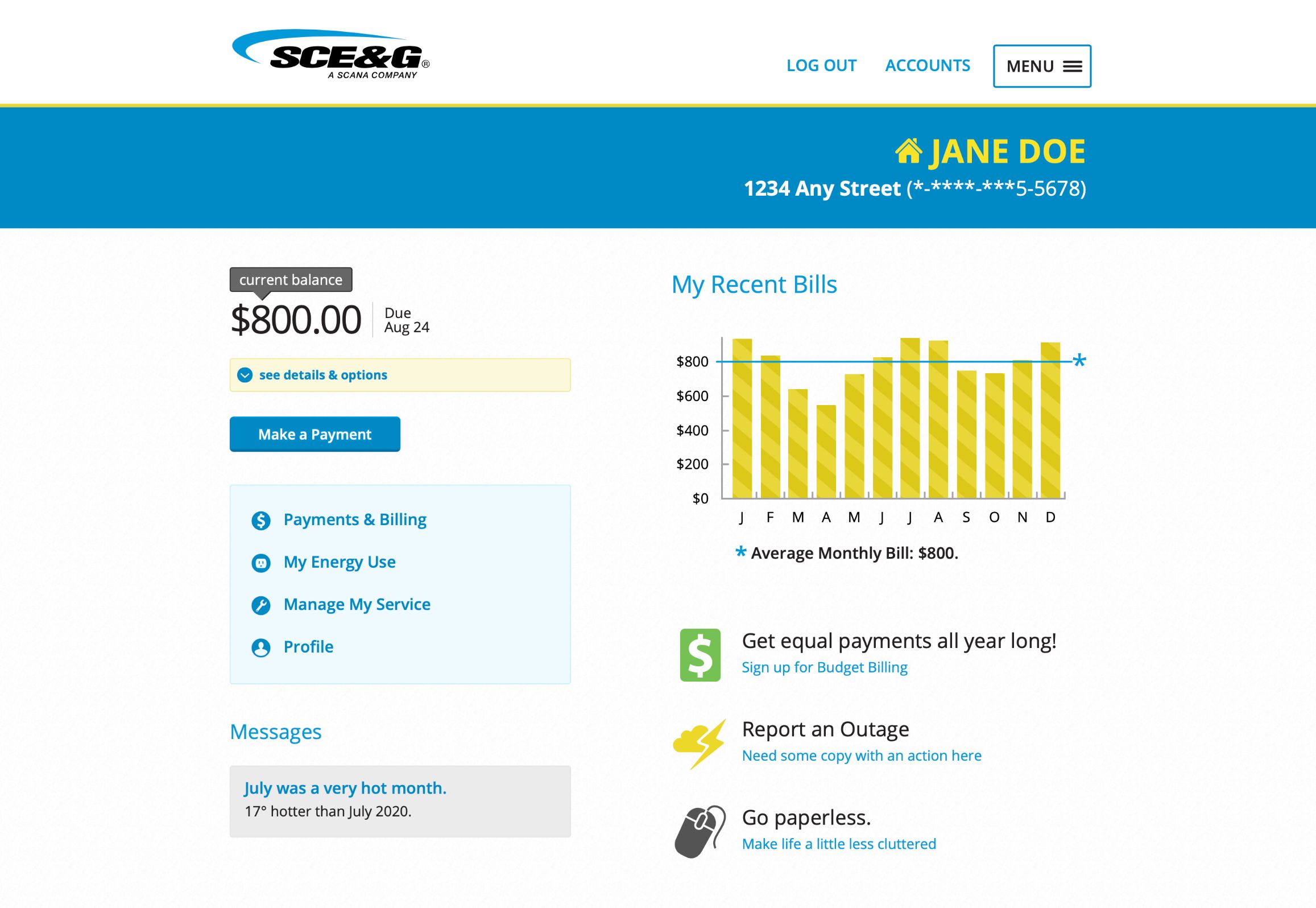
The current account management system is not keeping up with modern users’ expectations. Start over with user-focused actions behind the login.

Create an experience so easy that even dreaded tasks feel like a breeze.

To the Point

This guiding statement targets the root of the problem.

Definition and Design that could only belong to this business and these users.

Whiteboard sketch for the SCE&G account registration page, documenting step 4, filling out the username, password, and email address. Requirements are jotted to the left in blue and red marker.

Brainstorming. Whiteboard sketching honed in on simplifying cumbersome processes.

Wireframe for the SCE&G account registration page, with content blocks fleshed out for top nav, account registration steps, form fields, contact information, and footer.

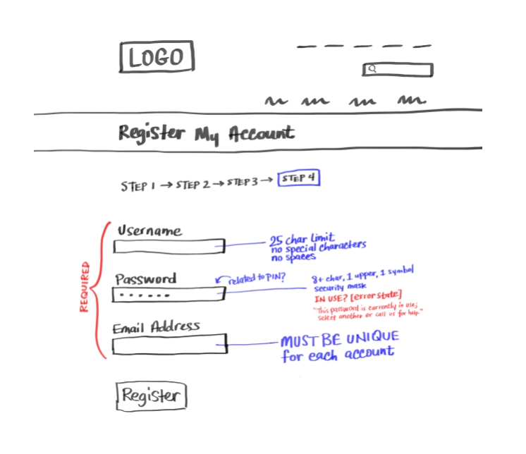
Wireframe. Define screens that align with how real people think about account management.

Final, polished design for the SCE&G account registration page, with the logo, brand colors, and graphical elements defined.

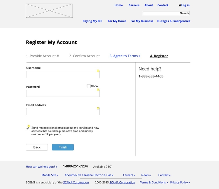
Design. Interactions gain even more ease of use with design thought in a testing prototype.

Testing with real customers removed any questions for a successful launch.

Screenshot from a user video test, showing a browser screen displaying the SCE&G payment confirmation page in the background and a video feed of the user in bottom right.

User Quotes

“I love the visual breakdown of my usage.”


“Paid my bill in a flash.”


“The payment button is way too far away from the amount.”


Recommendations for an Account Summary Expander Link & Block from a UX roadmap. Left column shows a visual breakdown of the recommended changes. Right column provides a bulleted text list with detailed explanations.

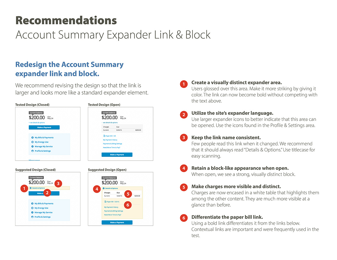
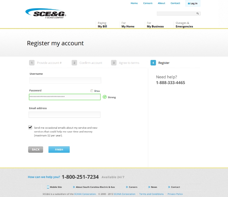
Prototype Updates. Testing revealed areas to adjust for ultimate launch success.

User test results for Profile & Settings, showing that most people avoided the account detail accordion. Two columns compare and contrast desktop and smart phone results with easy to scan visual illustrations.

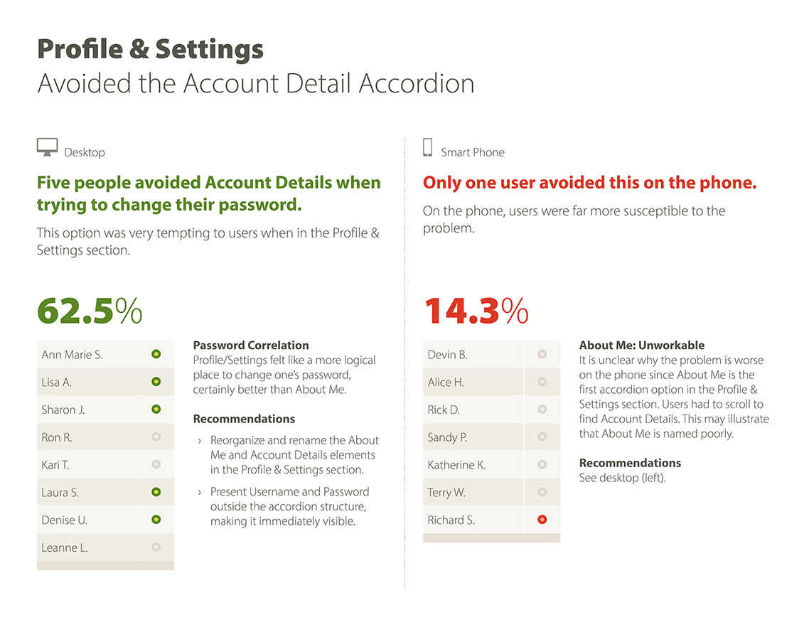
Understanding Patterns. Common user behavior informed what was working well and what changes were needed before going live.

The Final Product positioned the organization as a user-focused industry leader.

Mobile SCE&G landing page. A top banner displays the account information above the current balance and due date, a table of current charges and due date, quick links, and payment options.
Mobile transfer service page for SCE&G. Four blocks labelled 1 through 4 outline the steps required to transfer service, with the first block active, above fields to enter the new address information.
Mobile page for changing automatic payments. Two dropdowns provide options for setting the payment date and selecting which account to use, along with a text link to add account. At the bottom of the page, an FAQ section.

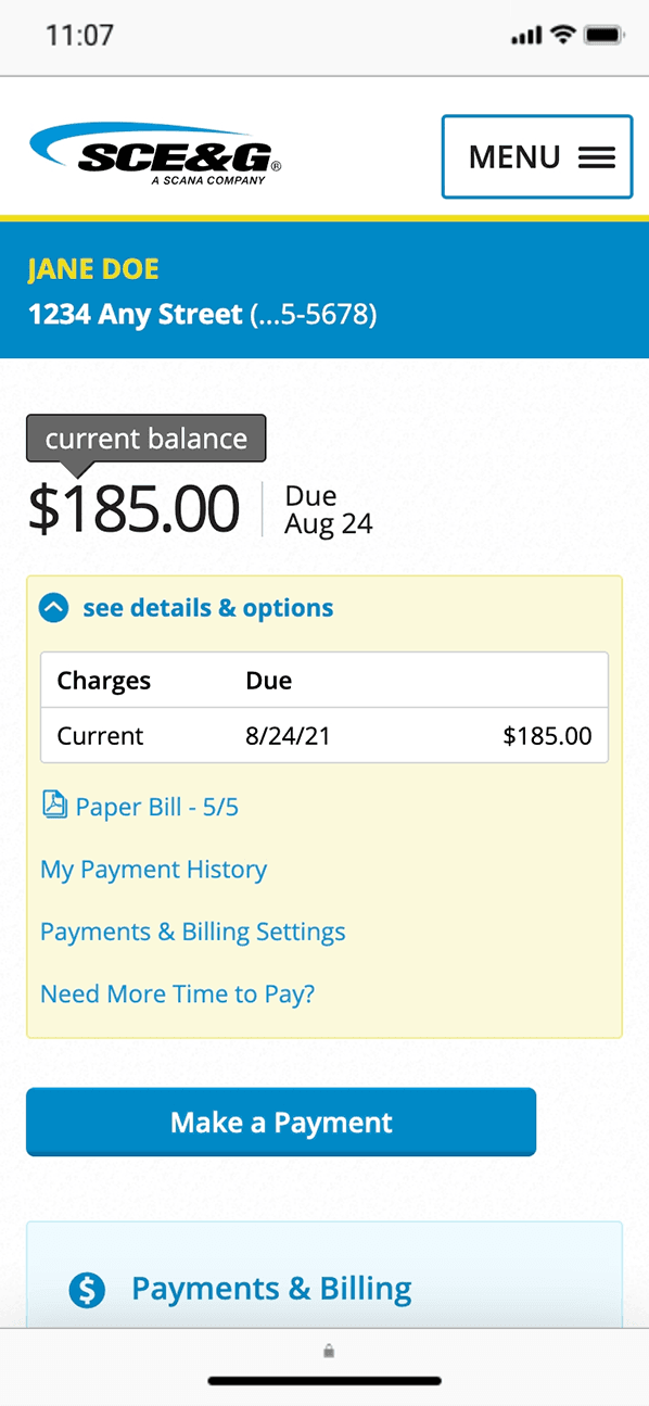
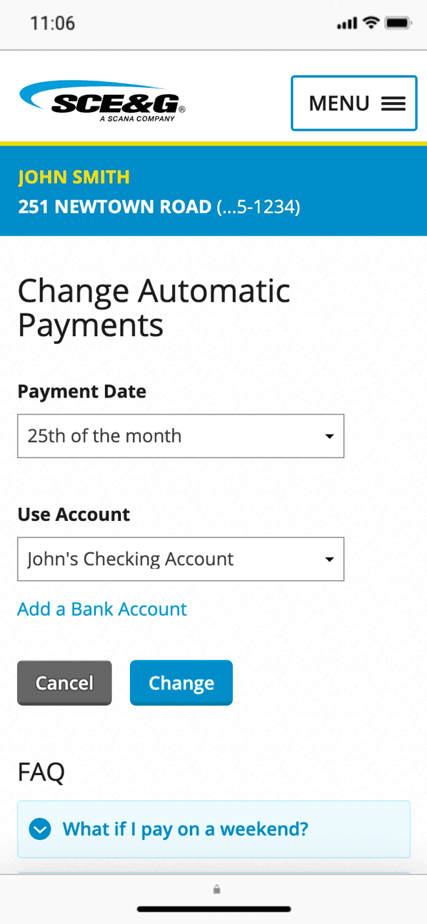
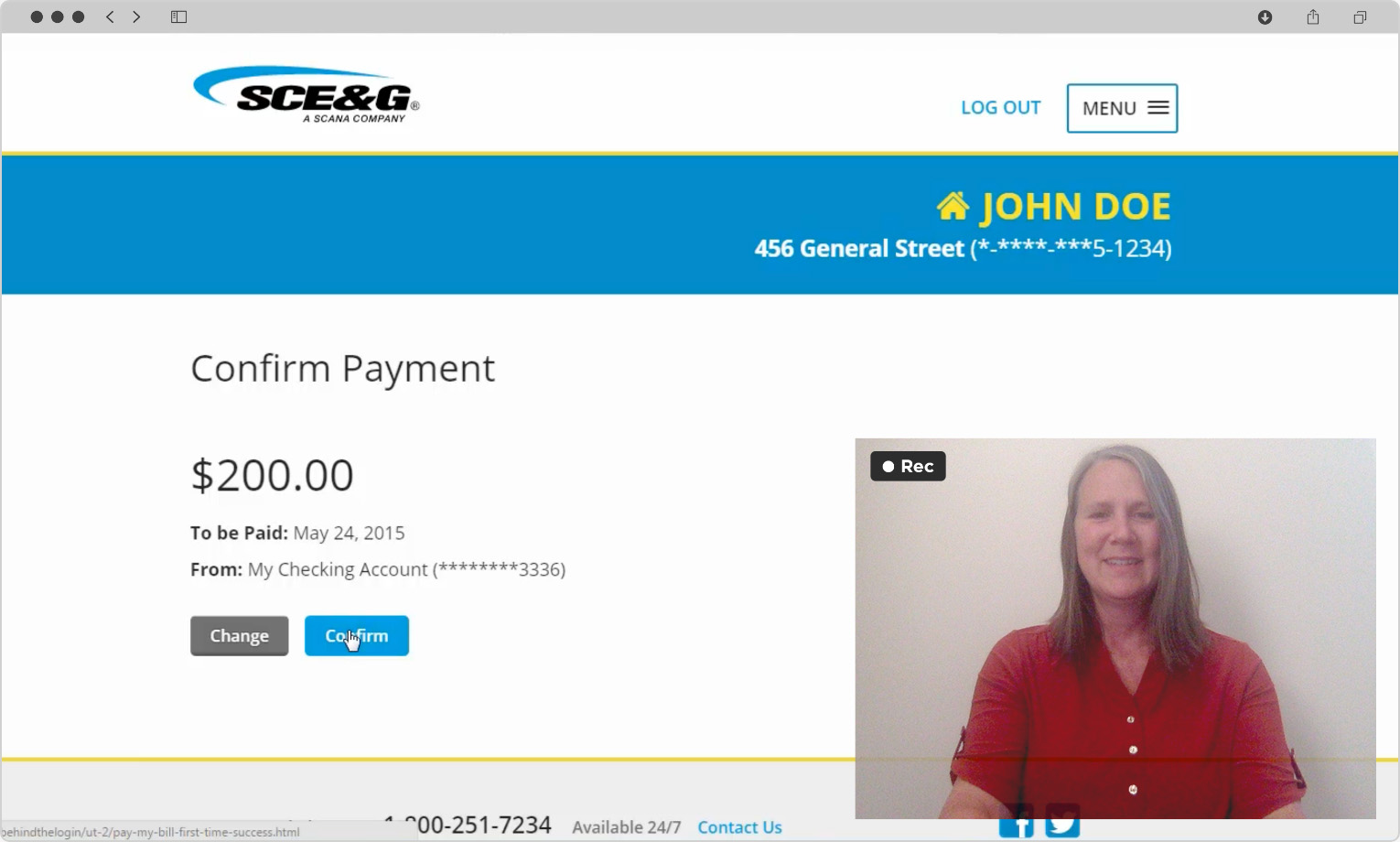
Meant for Mobile. A significant percentage of users access the product exclusively with mobile devices, particularly smart phones. We defined and designed for this from the start.

Service request page on SCE&G.com, showing a blue banner for account information above a grey block highlighting recent requests, and blue blocks highlighting other service management options. On the right are 5 quick links with icons, headings, and brief descriptions,

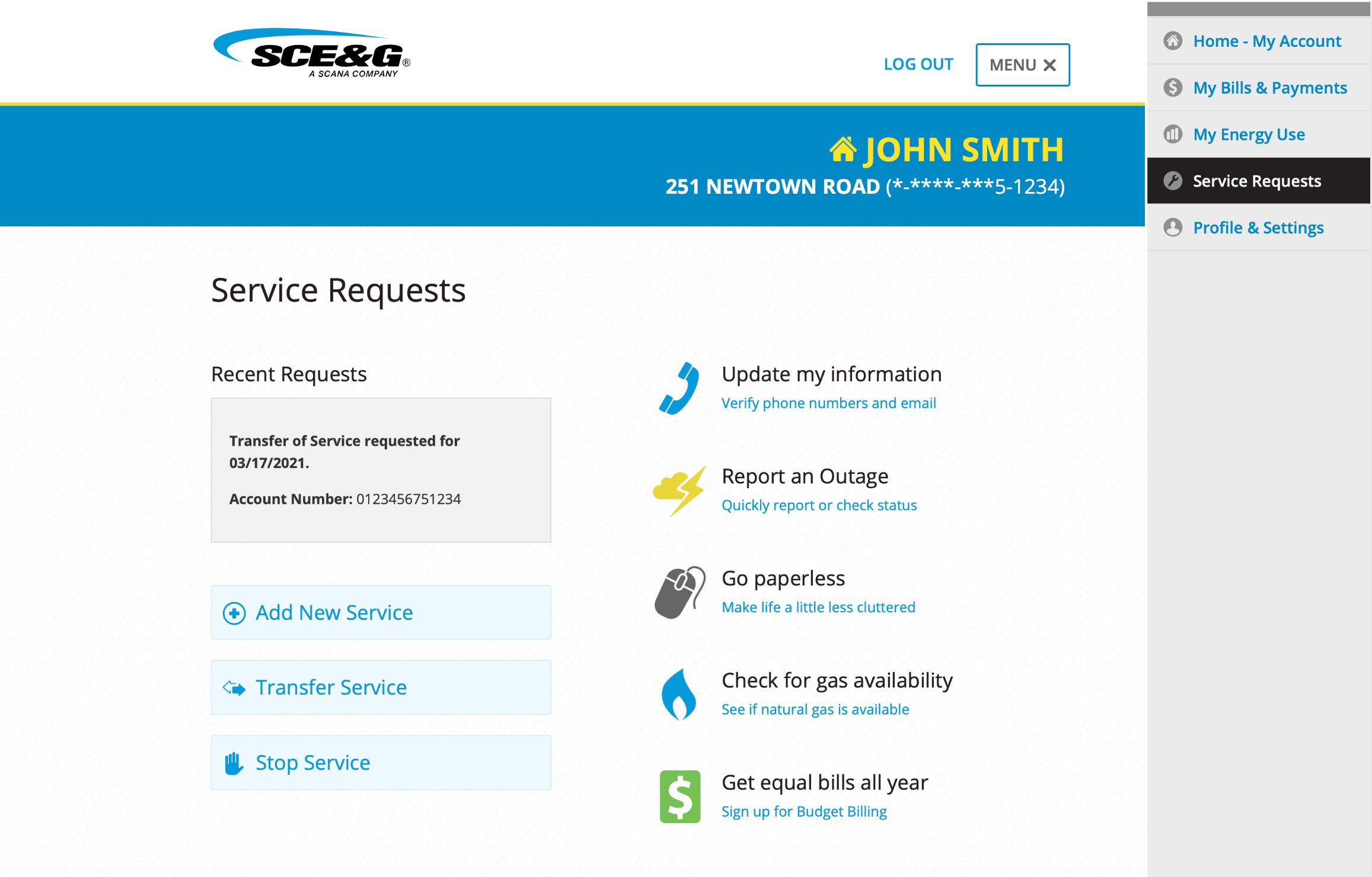
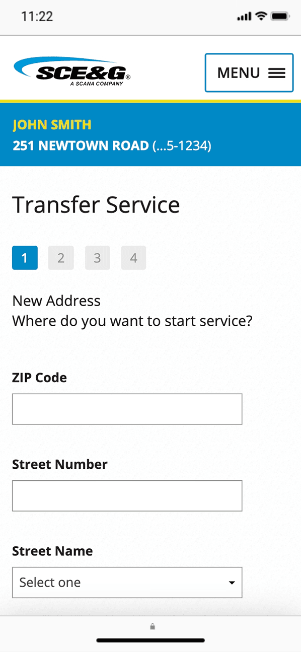
Effortless Service Management. Starting, stopping, or transferring service should be painless and easy. Our process ensured this.

Current balance area showing $0 with no due date. Below, a button to Make a Payment and a text link for My Payment History.
Current balance area showing $-88 with a green Credit Balance flag and no payment date. Below, a button to Make a Payment and a text link for My Payment History.
Current balance area showing $450.27 with a red Past Due Balance flag and red text show that it's Due Now. Below, a button to Make a Payment and a text link for My Payment History.
Current balance area showing $800.50 with a due date of May 24. Below, an expanded view of Payments Scheduled with Current Charges, Automatic Payments, and a button to Make a Payment.
Current balance area showing $215.43 with a due date of May 24, and a grey flag showing Budget Billing Amount. Below, an expanded view of Details & Options showing Charges, link to the Paper Bill, and a button to Make a Payment.
Current balance area showing $1,623.58 and $825.53 due now, with a red flag for Past & Current Charges. Below, an expanded view of Payments Scheduled / Details & Options with tables for Charges and Scheduled Payments, then a button to Make a Payment.

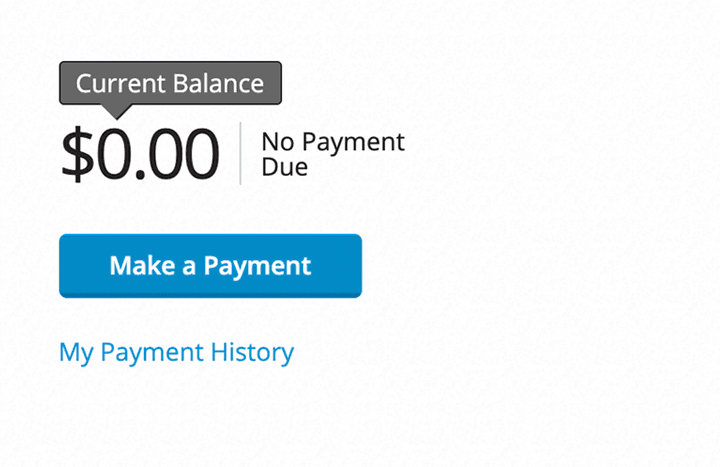
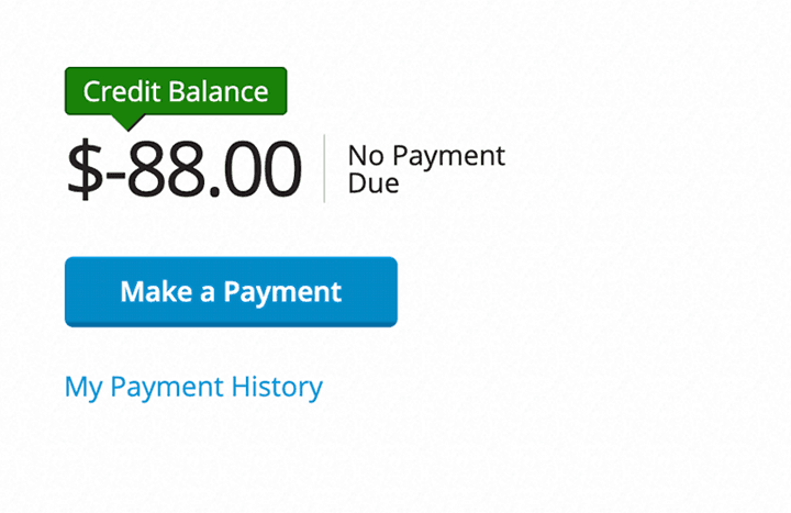
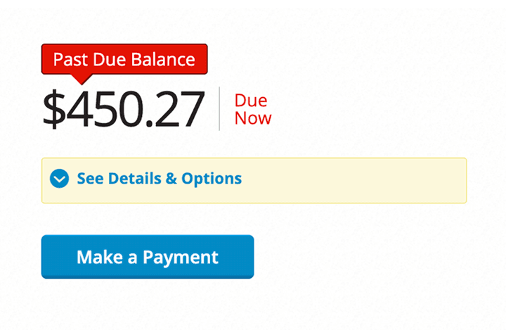
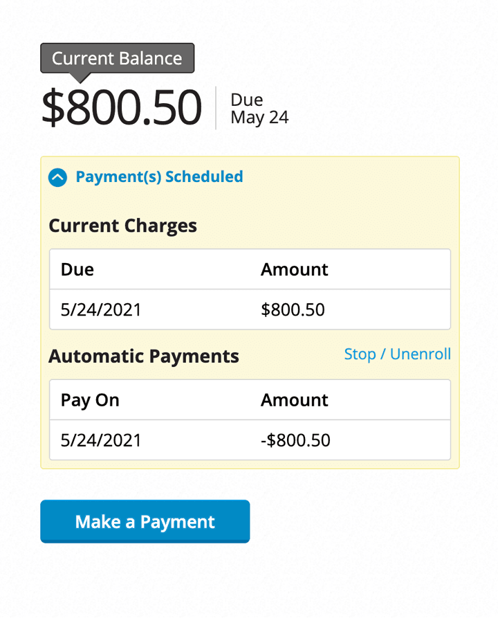
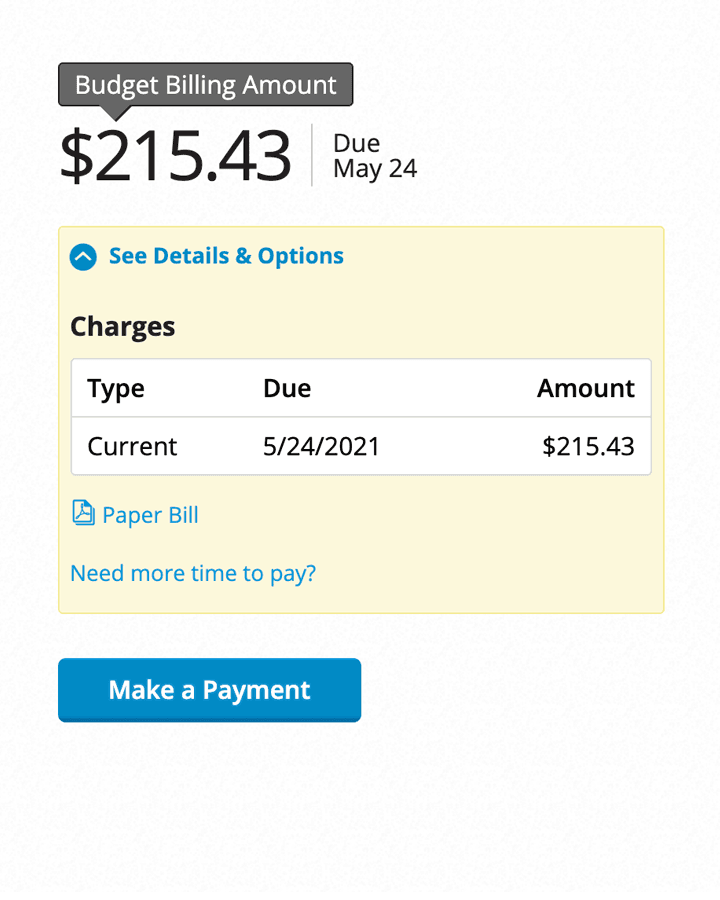
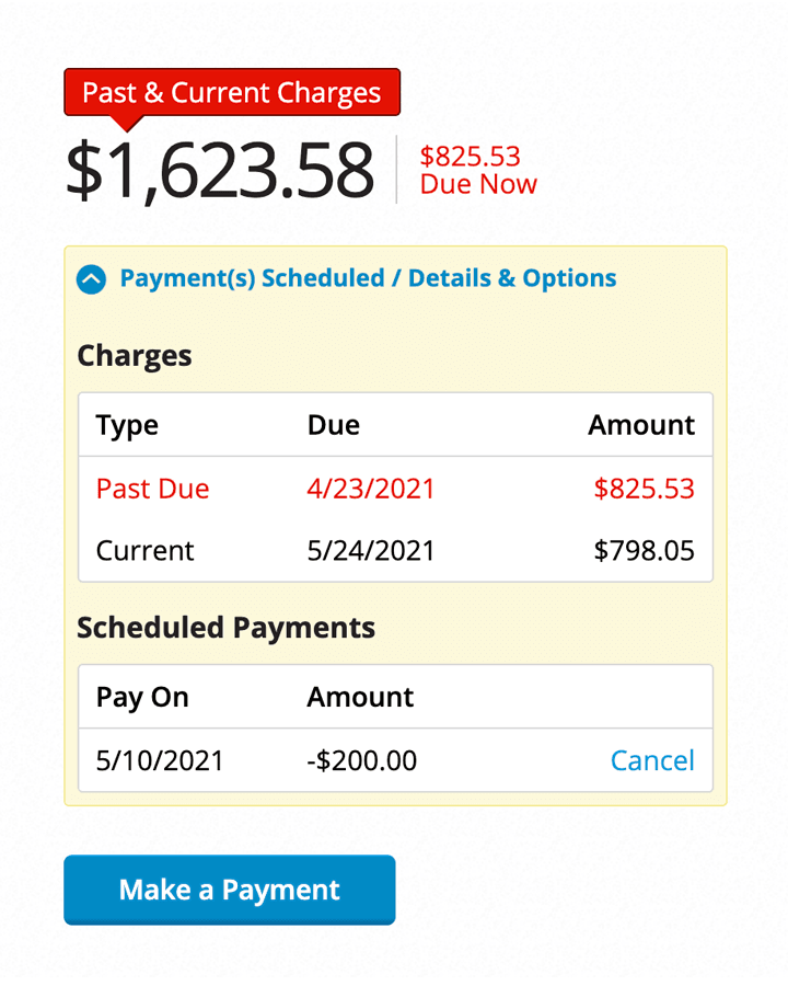
Variants and Edge Cases. We designed for flexibility, allowing for a nearly endless array of “balance due” possibilities, all stress tested with users before launch.

Results prove the value of continuously implementing a cohesive UX strategy.

Reversed Negative Site Perception

Many users began favoring online bill pay over other payment options.

New Online Energy

A month after launch, site metrics had already surged dramatically.

Top Customer Satisfaction Scores

Scores for interactions in the new experience ranked higher than ever before.
Digital Service Attribute Report

Opportunities for Exploration

Less hassle with basic tasks pushed users towards more advanced online features.

  • #1 Industry Usability, Southern Region E-Source
  • # 7 Industry Usability, United States E-Source
Truematter strikes the right balance of 'getting' our business and making solid recommendations based on user input.
— Customer Insights and User Experience Manager, Dominion Energy (SCANA Corporation)

Our approach will work for you.

Let's Talk