UI Uniformity
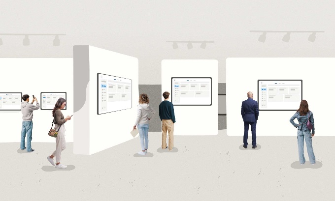
Bland, lifeless UI is everywhere, sameness as far as the eye can see. Despite varied purposes and users, apps today inundate us with identical white backgrounds, rounded gray boxes, tiny text, and side navigation paired with obligatory icons. Swap out one logo for another and you will not make much difference.
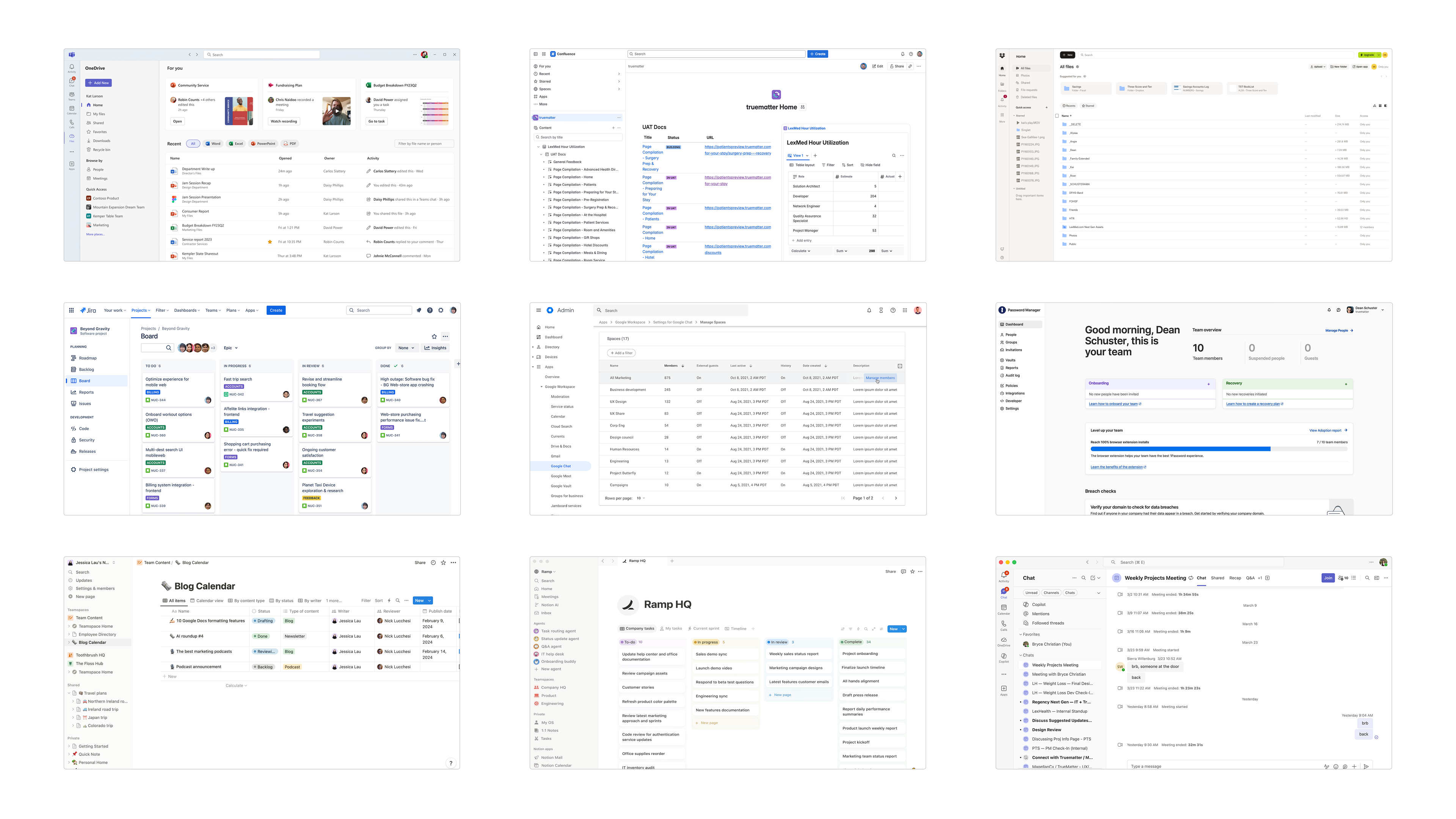
Sameness and AI
There are many reasons for web app uniformity. Standards are continually emerging. Component libraries drive consistency. It is easier to imitate than to think. Which brings us to AI.
Prompt your way to an app using your favorite generative tool. Chances are the resulting interface will look just like everything else. AI is not an original creative force. It reflects what already exists.
Sameness is a real phenomenon, one that AI appears to reinforce. We wanted to know exactly how and why. Being an AI-forward shop, we asked Claude:
“Why do AI-generated interfaces all look the same?”
Claude’s Answers
Claude responded in an instant, offering six blunt answers that naturally missed the deeper point entirely. Things got a bit technical, so we have interpreted for your convenience.
Claude Answer 1
“Training Data Bias Toward ‘Safe’ Design”
“Most AI models are trained on examples that skew toward clean, minimal, blue-and-white SaaS interfaces. The model learns that this is what ‘good UI’ looks like, so it defaults to it constantly.”
Translation
Everyone else is doing it.
Ask Yourself
Is my product truly the same as all other products? Are my users the same as all other users?
Claude Answer 2
“Optimization for Legibility Over Creativity”
“AI systems are often evaluated on whether the interface works and is readable, not on whether it's visually distinctive. So they converge on whatever reliably passes those tests—which tends to be Tailwind defaults, Inter font, rounded cards, and muted grays.”
Translation
Get really used to 14pt fonts presented in muted gray and rounded cards.
Ask Yourself
If an interface seems clean and legible, does that mean it is strategically sound or even accessible?
Claude Answer 3
“Lack of Genuine Aesthetic Intent”
“Human designers make choices driven by brand identity, emotion, cultural context, or just personal taste. AI doesn't have a ‘point of view’ unless you push it to develop one. Without that pressure, it averages everything out into a bland consensus aesthetic.”
Translation
I’m sorry, Dave, I’m afraid I can’t do that.
Ask Yourself
How much direction are you prepared to give AI? Do you know what kind of direction is right?
Claude Answer 4
“Component Library Lock-In”
“Most AI-generated UI leans heavily on the same few component libraries (shadcn, Material UI, Chakra). These resources have strong visual opinions baked in, and the AI rarely deviates from their defaults.”
Translation
One of us. One of us.
Ask Yourself
Where is the line between standards and mimicry? When Google sneezes, must we all catch a cold?
Claude Answer 5
“The ‘Competent Median’ Problem”
“AI is very good at producing something that looks fine — not embarrassing, not broken. But ‘fine’ and ‘distinctive’ are almost opposites. Creativity requires taking risks that might look bad, which AI systems naturally avoid.”
Translation
It’s fine. Your app is fine. Just fine.
Ask Yourself
Is it enough that your product avoids “looking bad”?
Claude Answer 6
“How to Break Out of It”
“The main levers are: giving strong aesthetic constraints upfront (‘brutalist’, ‘editorial magazine’, ‘90s retro terminal’), referencing specific designers or eras, specifying non-default palettes explicitly, or iterating with feedback on the feeling rather than just the function. AI has the capability for more interesting outputs, but it needs direction to get there.”
Translation
We look forward to your “90s retro terminal” pharmacy app.
Ask Yourself
Are you focused on aesthetics and feelings or do you want to make a useful product?
Beyond the Generic
We asked why generated apps and software all seem to look the same. Claude answered impeccably but didn’t grasp the full implications of the question.
It is not acceptable for one product to be indistinguishable from another or, indeed, many, many others. If generic uniformity were a virtue, interfaces alone would be the key to success. If we could just get the UI right, our product would be accepted, used, and profitable. Nonsense.
When everything is nearly identical, you are not looking at generic interfaces; you are looking at generic thinking. Claude missed this nuance.
Generative tools may be near miraculous, but they relentlessly reproduce interface patterns, raising duplication to a hyper-efficient art form. This puts us in a bizarre UI feedback loop. Web apps tend to look alike. AI ingests this tedium and instantly delivers the same dull sameness.
We reinforce this cycle when we uncritically accept AI’s version-one, bland interfaces. We are simply being lazy, carelessly assuming AI will think for us. Laziness with a bulldozer is the same as laziness with a spoon.
Human Intelligence
AI tools are only as good as our thoughtful, persistent orchestration allows them to be. This direction can be difficult and must have a sound basis. We cannot make great products by imitating other interfaces, whether AI does the imitating or not.
The best products are driven wholly by the deep, foundational thinking that makes them unique. Interfaces are the product of business strategy, the specific problems we are trying to solve, and the users we serve. Focus here and we are much more likely to create exceptional, valuable products from the ground up. The right, distinctive UI will naturally follow.
Coherent direction matters most. Sound thinking differentiates products.

Written By Dean Schuster

Founder and Owner of truematter
Dean Schuster has been creating human-centered digital products since the beginning of the commercial web. He speaks and teaches user experience all over the world.