Your Color Choices Could Be Keeping Your Site or App from Digital Accessibility
4 min read

Color contrast is an area of accessibility where many, many websites and applications fail compliance royally. Many organizations’ brand colors are not created with online accessibility in mind, so when these colors on viewed on a screen, the result is often poor color contrast.
This area of accessibility requirements can cause a lot of heartache because, in some cases, it can mean tweaking your established brand colors to meet accessibility standards. Not a fun sell to the folks in marketing and communications departments. If at all possible, organizations should plan their color palettes and design systems with digital accessibility in mind to avoid a world of frustration later on.
The WCAG Guidelines
The general rule of thumb for accessibility compliant color contrast is that it must be easy to differentiate text from its background and links must clearly stand out from non-linked text.
- Distinguishable Principle – These guidelines fall under WCAG’s principle that online content and interactions must be “distinguishable.”
Use More than Just Color to Indicate Actions
Guideline 1.4.1 requires that “color is not used as the only means of conveying information, indicating an action, prompting a response, or distinguishing a visual element.”
Create Solid Color Contrast
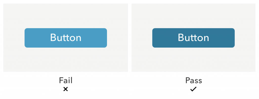
Guideline 1.4.3 requires that “the visual presentation of text and images of text has a contrast ratio of at least 4.5:1.”
What it Means for Users with Disabilities
People with low vision or who don’t see colors well (those with color blindness, for example) can’t read text or identify links if the foreground color is too similar to the background color. This mean they can’t identify actions easily or easily read any of your content. Even where the contrast ratio between text and the background is acceptable, you should still never assume that color will be enough to help a user identify links.
Best Practices
Check color contrast for all text.
Use a tool like WebAim Color Contrast Checker to see if your text falls into compliance. The minimum contrast for regular text is 4.5:1 unless you are using large text (at least 18 pt or 14 pt bold). For large text, the minimum contrast is 3:1.
Add a non-color design element to identify text links.
Identify links in a way that does not rely solely on color. Use design elements like underlines, carats, or icons.
Example: Relying Only on Color to Identify Links
Example: Using a Second Non-Color Indicator for Links

Do Everyone a Favor
The rules of color contrast aren’t just useful for those with disabilities – they are helpful and courteous to everyone using your site or app. You don’t have to have an official disability to find low color contrast hard to read and generally unpleasant. There are some combinations of background and text color that will make any set of human eyeballs scream.
Also, unfortunately, many sites and apps use inconsistent link colors or do not differentiate well between text and links. That leads to general uncertainty about what can and can’t be clicked, regardless of ability or disability. Do yourself a favor, do your business a favor, and do all of your users a favor. Pay careful attention to color contrast in your digital products.
Next Post in This Series
Creating Navigable Page Structures: An Accessibility Building Block
Part of the Accessibility for Developers Whitepaper
You can download the full whitepaper from the Progress site.
All Posts in This Series
- PDFs: The Most Difficult, Most Widespread Digital Accessibility Problem
- Forms Don’t Have to Be Fun but They Do Have to Be Accessible
- People With Disabilities Like TV and Podcasts, Too
- The Accessibility Requirement You’re Probably Failing Right Now: Focus States
- Your Color Choice Could Be Keeping Your Site or App from Digital Accessibility
- Creating Navigable Page Structures: An Accessibility Building Block
- Alt = “Title for a Post That Doesn’t Actually Describe It Whatsoever”
Written By Bekah Rice
UX Designer/Developer and Accessibility Lead
Bekah helps national and international clients create complex interfaces that seem effortless. She is a digital accessibility expert, helping the interactive community create experiences that are inclusive and usable for all.