Essential User Traits: Lessons from a Can Opener
5 min read
User Lessons from the Humble Can Opener
You probably keep a few canned items in your pantry: beans, tomatoes, soup, maybe some pumpkin pie filling this time of year. Non-perishable, ready-to-eat food is convenient; it helps us get dinner on the table (and pies in the oven) exponentially faster.
However, cans are metal. Unless you’re Edward Scissorhands, you’re going to need a tool to open them.
The first cans—made of thick wrought iron—required a hammer and chisel and lots of effort to open. Even when cans became thinner, the first patented can opener was little more than a blade that still required a good bit of effort along with a small blood sacrifice.
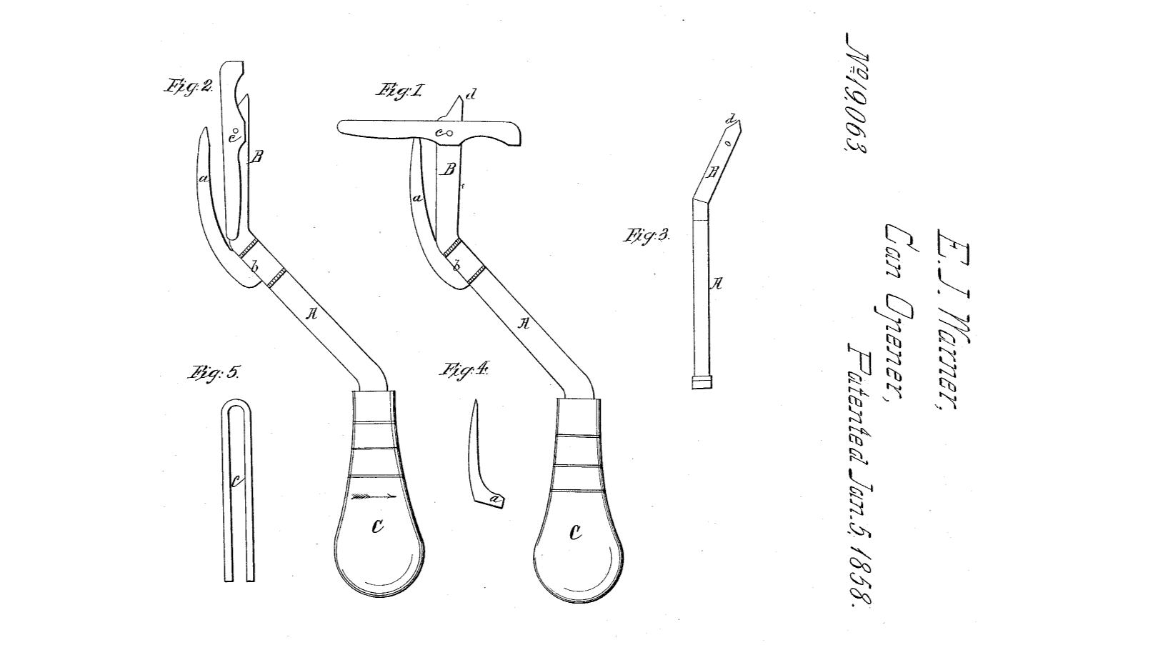
Source: Google Patents
Unsurprisingly, people didn’t like using these tools. So, technology kept progressing until we arrived at modern can openers as we know them. You can find a few varieties in stores today, but they all exist for one purpose: to open cans with minimal
fuss. They rarely come with instruction manuals because they’re meant to be so simple to use. But even this rudimentary tool has its variations and frustrations, which can teach us a lot about how people will interact with even the
simplest app, site, or software.
Users will go for the simplest option requiring the least amount of effort—for them.
Humans are engineered to want one thing: a big, red EASY button. By and large, people will opt for the easy thing over the hard thing. You could print out your tax forms and the 115-odd pages of instructions that go with it. Or you could just sign in to TurboTax, and let them deal with the complexity for you.
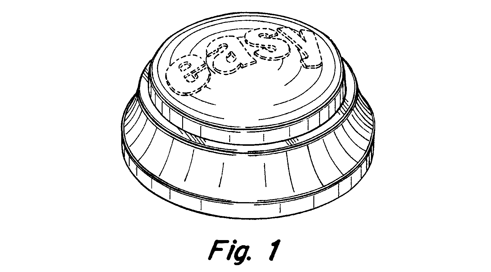
Source: Google Patents
While we often overcomplicate things in the name of innovation, users will appreciate the thing that helps them accomplish their task with the least amount of effort—as they perceive it. Those with dexterity or grip issues might prefer an electric
can opener, while those who abhor wrangling cords might prefer a manual opener even if it takes a little muscle. An ultralight backpacker might opt for cans with a pull tab, so they can bypass the can opener entirely. The lesson here? Know what’s
easiest and best for your users, then give it to them—or they’ll find it elsewhere.
Users are enterprising and unpredictable.
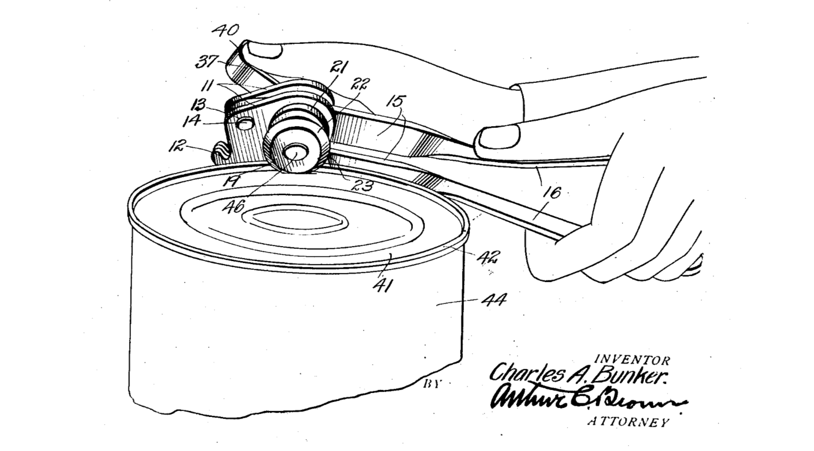
You can dream up a great feature or tool, but users won’t necessarily grok it (i.e., take to it easily and intuitively). Instead, they’ll find workarounds and pave their own path forward. This holds true for something as seemingly straight-forward as a manual can opener. Even with minimal moving parts—usually a knob that turns and a handle that opens and closes—there are endless debates and YouTube videos and Reddit posts about the right and wrong way to use this tool.
Source: Google Patents
The patent shows that a traditional Bunker can opener is intended to be held vertically, to cut the lid away from the inner edge of the can. However, this leaves a jagged edge and the possibility of the lid falling into the can. Some users accept this as a small but frustrating price for access to their baked beans. But some enterprising users discovered the can opener can also be held horizontally, which cleanly lops off the top of the can, seal and all. Chances are high that, likewise, your users will find their own methods and have their own preferences. They’ll interact with your product in whatever way works for them, which probably won’t be as you imagined. Plan for when—not if—they go off script.
Even savvy users will have trouble at some point.
Can openers are ubiquitous—you probably grew up with a manual one in the family junk drawer and/or an electric one mounted to a cabinet. We’ve been using can openers for years, and they can still be frustrating to operate. User error can occur for many reasons, beyond maintenance issues like rusty blades or a dead appliance. We might be in a rush, for instance, and not align the can opener on the seam correctly. Our hands might be wet, or maybe we have a temporary accessibility issue like a broken thumb.
At some point, even if your product is perfectly designed and very familiar, your users will still have trouble. When that happens, simple tools and simple products are easier and less time-consuming to troubleshoot than complex tools and complex products. You only have to fiddle with a can opener for a few seconds to get it to work as expected, while a fancy 3-in-1 contraption might require a peek at an online tutorial or user manual. Offer users grace via simplicity. The less mental energy and effort they must expend, the better their experience and the faster they can get on with their day.
Users don’t want another tool.
This one’s hard to hear. The tech industry is centered on designing and creating new digital products, after all. But users don’t want more technology. They want better technology to solve their problems and remove frustrations.
While many an entrepreneur has tried to reinvent the can opener, most of what’s available off the shelf today is based on the simple Bunker design shown above. The more fanciful iterations are
less popular because they don’t significantly improve on what the traditional, old-school can opener can do. Unless you can significantly improve on what’s already out there, you’re going to be fighting an uphill battle for user
interest and buy-in. Rather than focusing on innovating, simply focus on supporting your users excellently.
The Cutting-Edge Truth
Users won’t change based on technology, so technology should change based on how users work. This is true of complex systems and manual tools alike. Users are out to solve their own problems, with or without your help. Your digital product will only become an essential, ubiquitous tool when you deeply understand your user’s goals and show that you can help them—easily, expediently, and with minimal fuss.


